Developing a colour scheme that looks natural yet has an artistic flair may seem complex, but design experts have brought us a number of clear rules that can bring a room together and define its look. Following these simple steps can be a starting point for turning a living room into a style icon, or a venue into a master showcase.

60-30-10 Rule
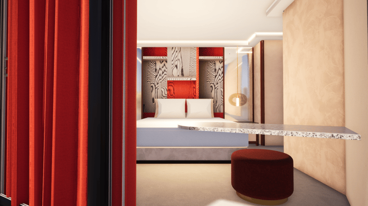
A fundamental rule for any designer, 60-30-10 outlines the percentages that are applied to each main colour that you want to include in the area. This principle gives a balance to the scheme that highlights key features of your design that you want to draw the focus to, and helps to bring proportion to the space. With this rule, you break the colours down into three main groups; the main colour, the secondary colour and the accent colour.
- Main Colour: 60%
- This colour will take up about 60% of the space, and define the look and feel of the area. This can include the floor, walls and be the base colour for main features such as furniture for rooms, or installations at a venue. Solid colour can be used in some cases, but usually each aspect takes on a varied hue and can include some secondary or accent colours to add shape and vibrancy.
- Secondary Colour: 30%
- This colour contributes 30% to your space, and should complement the main colour. The secondary should also add overall depth by adding a point of contrast, often done by reducing the saturation of the secondary colour to half of the main colour. The secondary should draw the users’ attention into to focus points and main features of the room or venue.
- Accent Colour: 10%
- This colour is only 10% of the scheme, and can be used to add a splash of extra vibrancy and impact. This colour can contrast more significantly with the main and secondary colours, and can be used on key points or features that you want as statement pieces, and give your final signature to the look. This colour can also be used throughout the décor to add depth and interest.
Use a Colour Wheel
A colour wheel can be a great tool to quickly help you pick colours that work well with each other. The wheel is divided into primary colours (yellow, red, blue), secondary colours (orange, violet, green) and tertiary colours.
Harmonious Colours
To easily decide on colours that will work harmoniously together in the 60-30-10 rule, just select three colours adjacent to each other on the wheel.
Complementary Colours
These colours are directly opposite each other on the wheel. When complementary colours are used together in a scheme, they offer the greatest contrast with each other, and are in effect, ‘opposite’ colours.
Rule of Three
The rule of three is fundamental for balance and dynamics with interior design. Three varying colours is considered to be the optimal number for a look that has depth and character. If you want to add more colours, try to use an odd number rather than even, which maintains the proportion across the features.
Be Consistent
If you’re working across multiple rooms or areas, keep a level of consistency between them with colour and shape. For example when using a scheme of three colours, try to keep at least one colour consistent between the areas, which is used across similar features.
Inspiration
At Visual Architects we have years of experience developing and co-ordinating colours, interior decor and design, transforming events and businesses across the UK and beyond. Have a look at some of our favourite projects to date and get inspiration for your next event or interior:
https://visual-architects.com/projects/